
White-label mobile app for football clubs
A multi-brand mobile product for European football clubs. The same platform had to work for different clubs, different brands, and different fan habits — while still feeling like “their” club app.
My role
I designed core mobile interfaces and key user flows, with a focus on personalization, consistency, and the everyday fan journey. I worked closely with product managers and developers.
The problem
Clubs already had fans, but many of them barely used the app. The product needed to become a place people open before, during, and after a match — not only when they buy a ticket.
The constraints
- One product had to support many club brands
- The interface needed to work at home and in a crowded stadium
- We had to keep the experience simple, even when the product included content, tickets, offers, and community features
The process
I started from the main fan scenarios: before the match, during the match, and after the match. Then I mapped the key screens and looked at where people dropped off or got lost.
Main App Flow
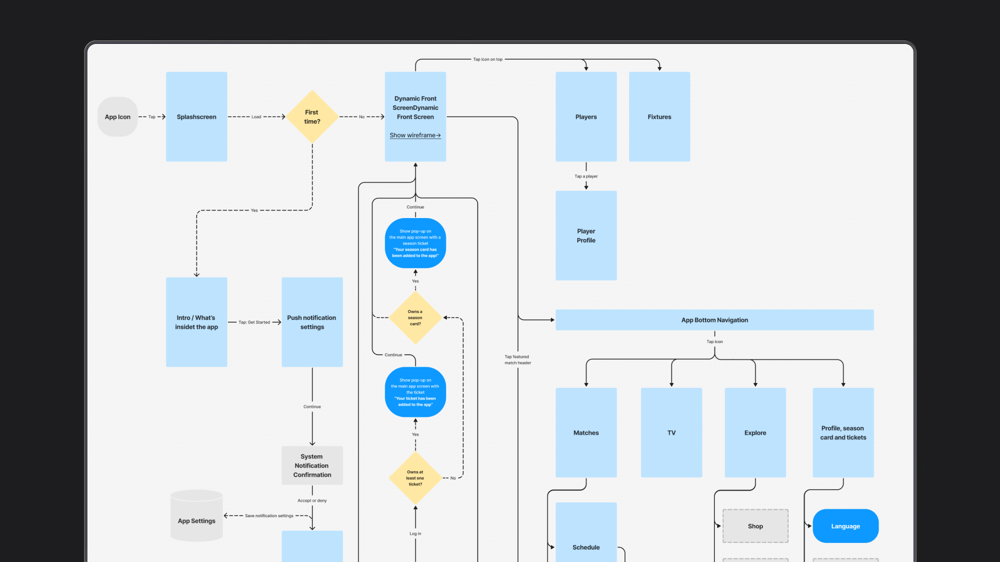
Before the screens I mapped how a new fan gets into the app. First open, permissions, login or skip, then the home screen.
The question was simple: what do we ask for, and when. Notifications and location matter on match day, but they should not block a person who only wants to see the next game. After login the same map shows where tickets and the season card live — that path continues in the ticketing block below.
What I designed
- A clearer structure for the core fan journey
- A more personalized home screen
- Consistent UI patterns that could be reused across clubs
- Better entry points to content, tickets, and match-day features
I also worked on the design system so new club apps could be launched faster without redesigning everything from scratch.
Home screen
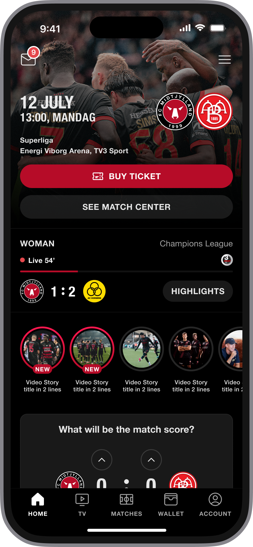
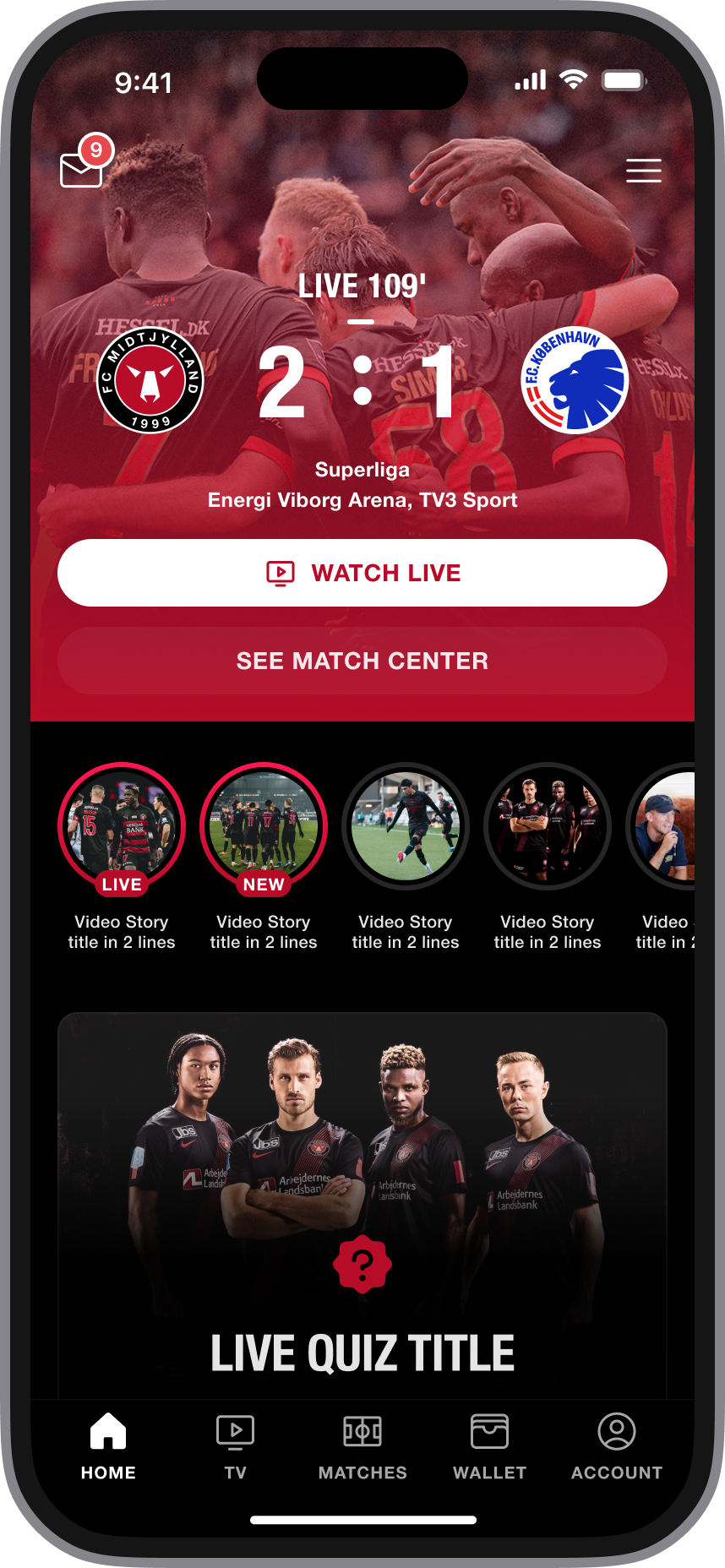
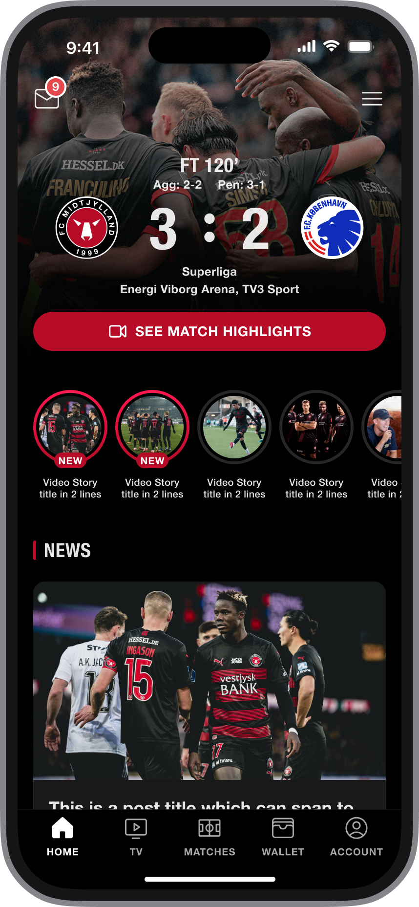
The first screen after opening the app. The goal was to show relevant content first, not every feature at once.
Match-day entry
A short path from home to live content, tickets, and quiz.
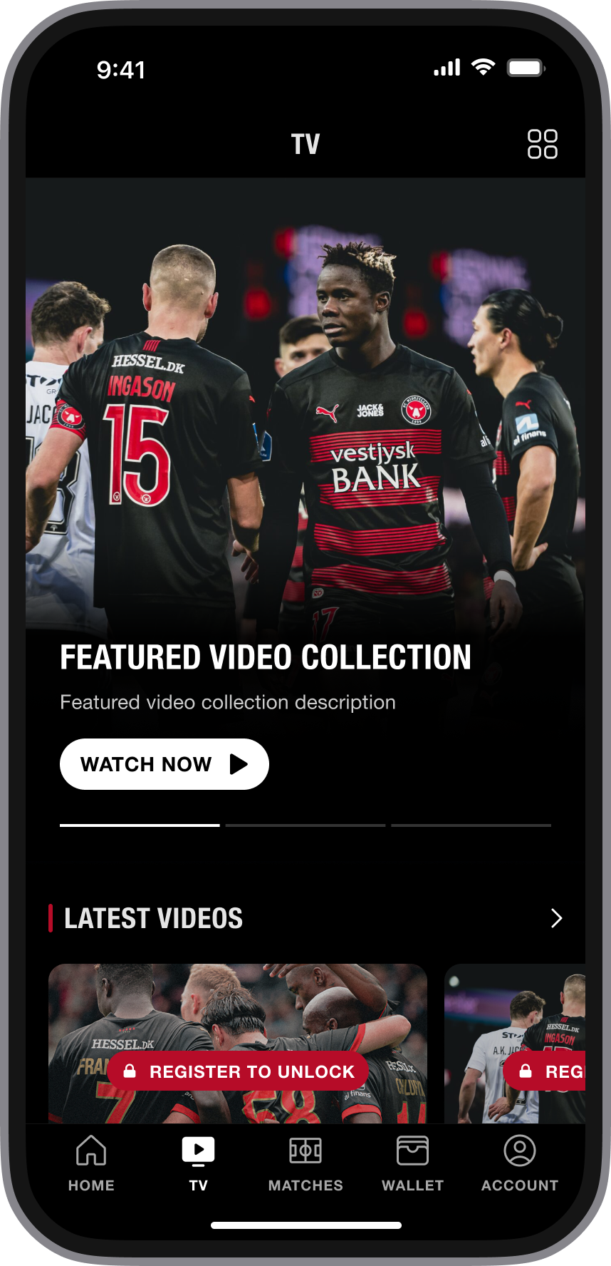
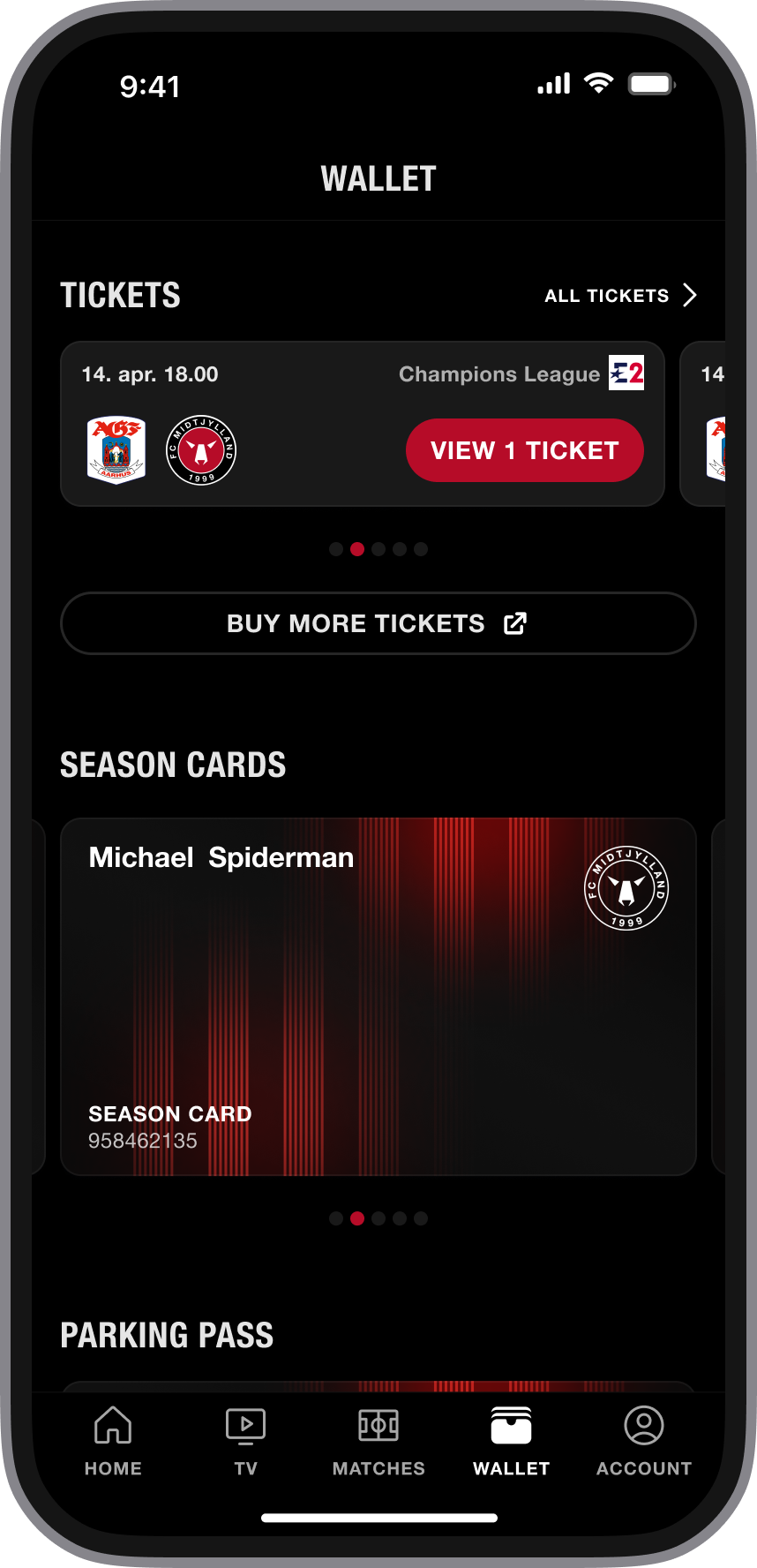
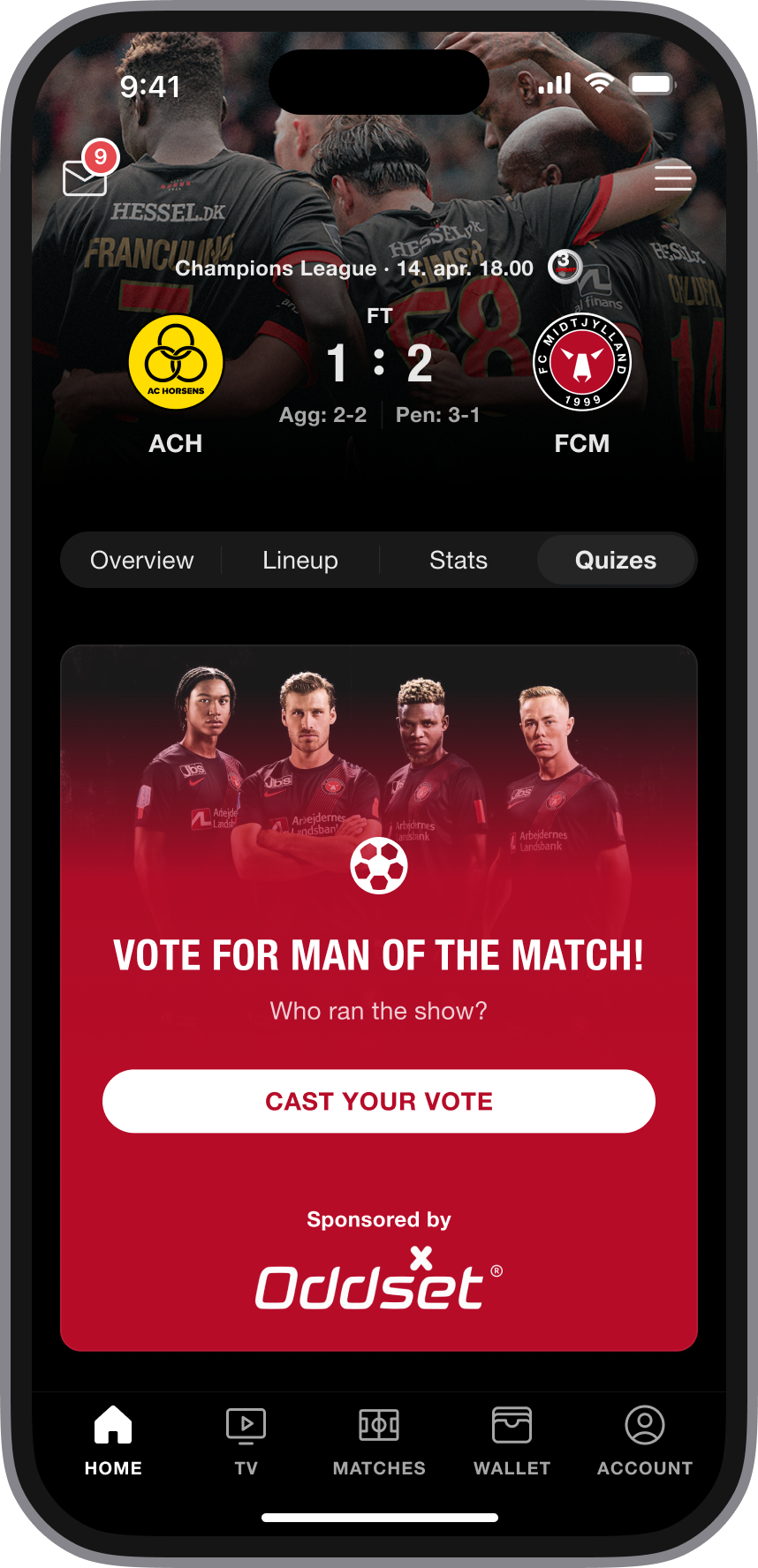
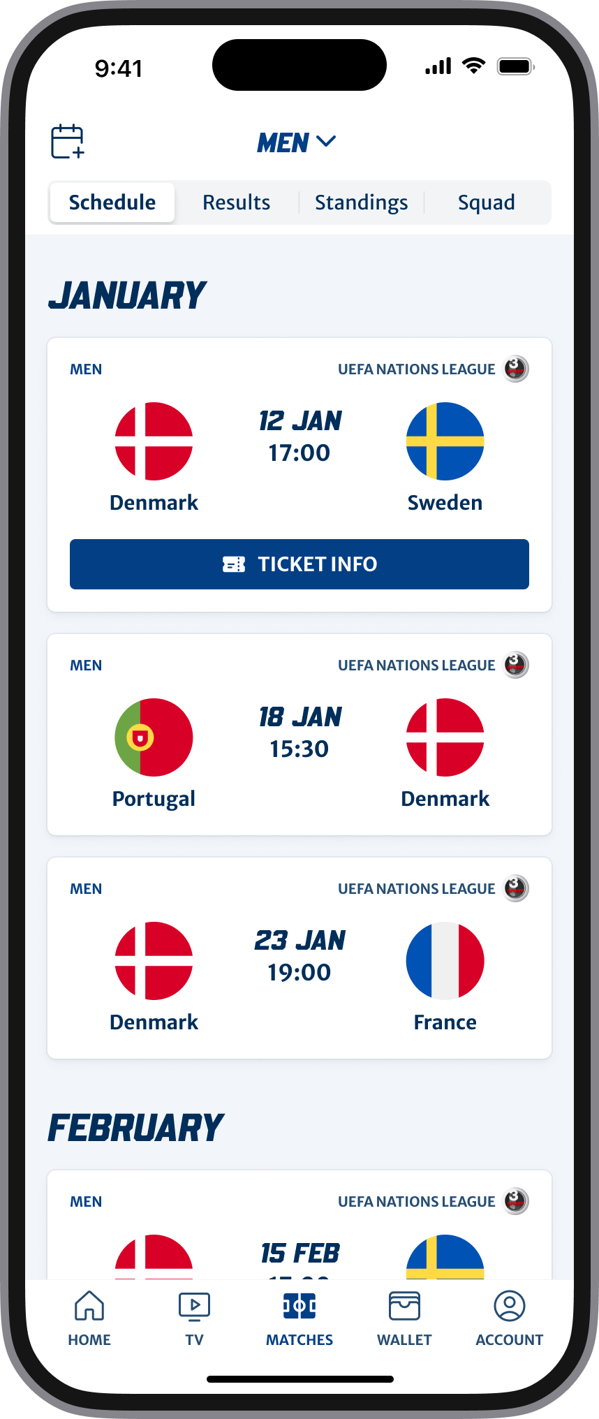
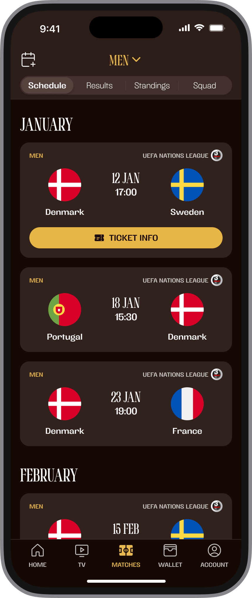
Same layout, different club
The UI stays consistent, while the brand changes. This was the core white-label problem.
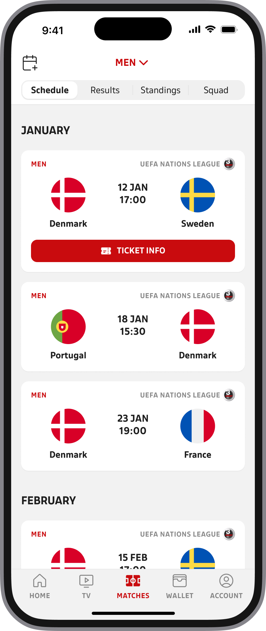
This product also included features like Live Quiz and personalized offers. I cover those in separate case studies.
Ticketing: two providers, many states
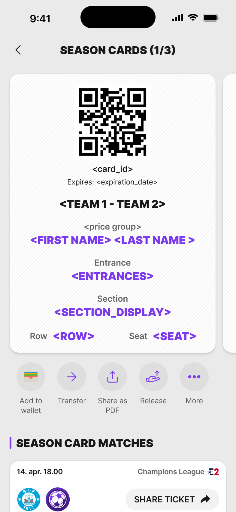
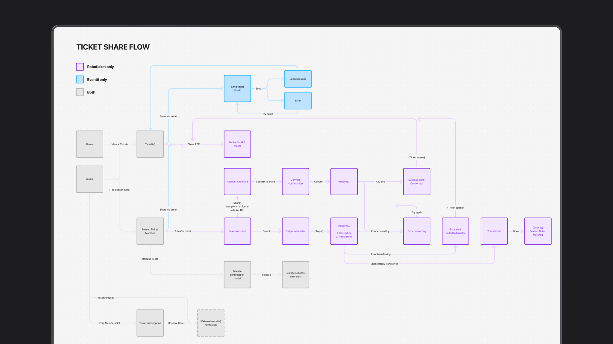
Ticketing was the hardest part of the club app. Fans could hold a single ticket or a season card. They could send a ticket to a friend or release a seat. Behind that were two providers — Roboticket and Eventii — with different rules, waiting states and errors.
I mapped the branches first, then designed the screens around them: account connected or not, friend already in the app or not, confirm, fail, done.
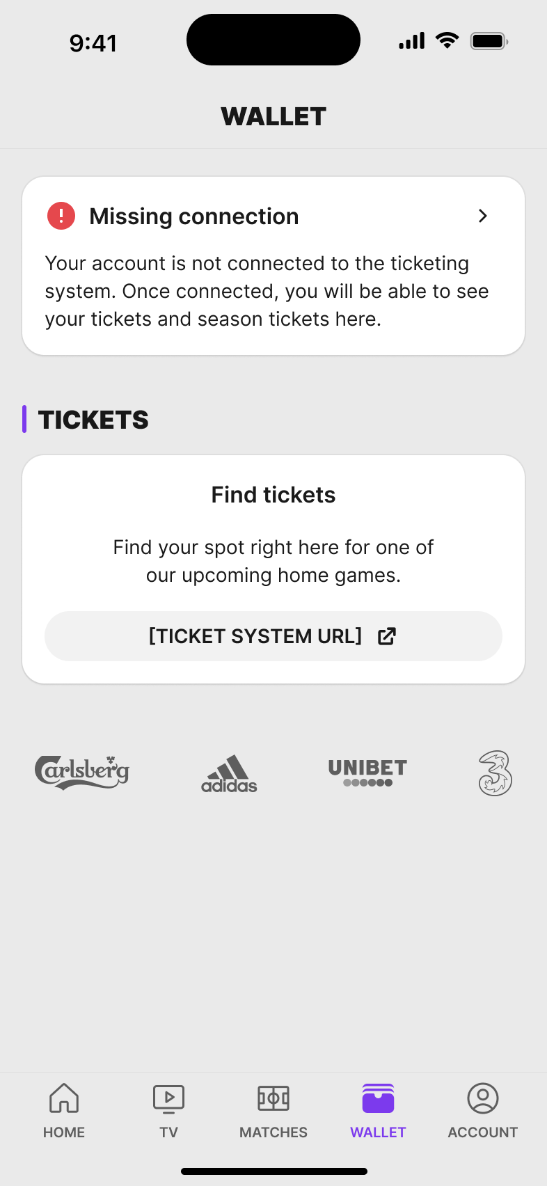
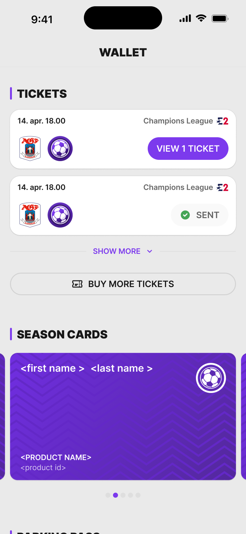
1. Wallet — Is the system even connected?
The wallet is empty until the fan account is linked to the ticketing system. After that the same place shows single tickets or a season card.
2. Transfer (main flow)
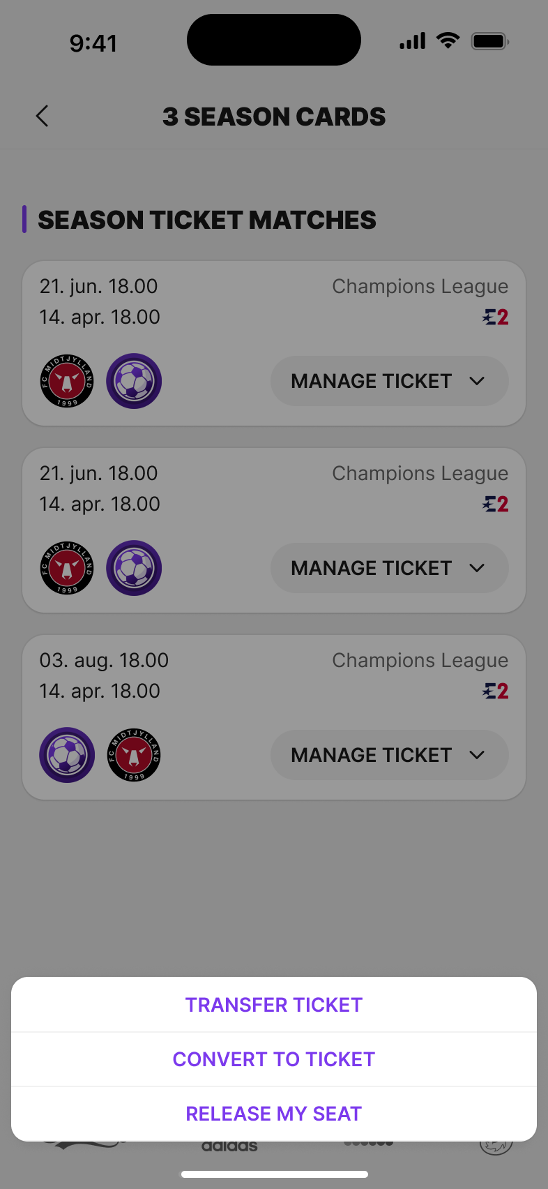
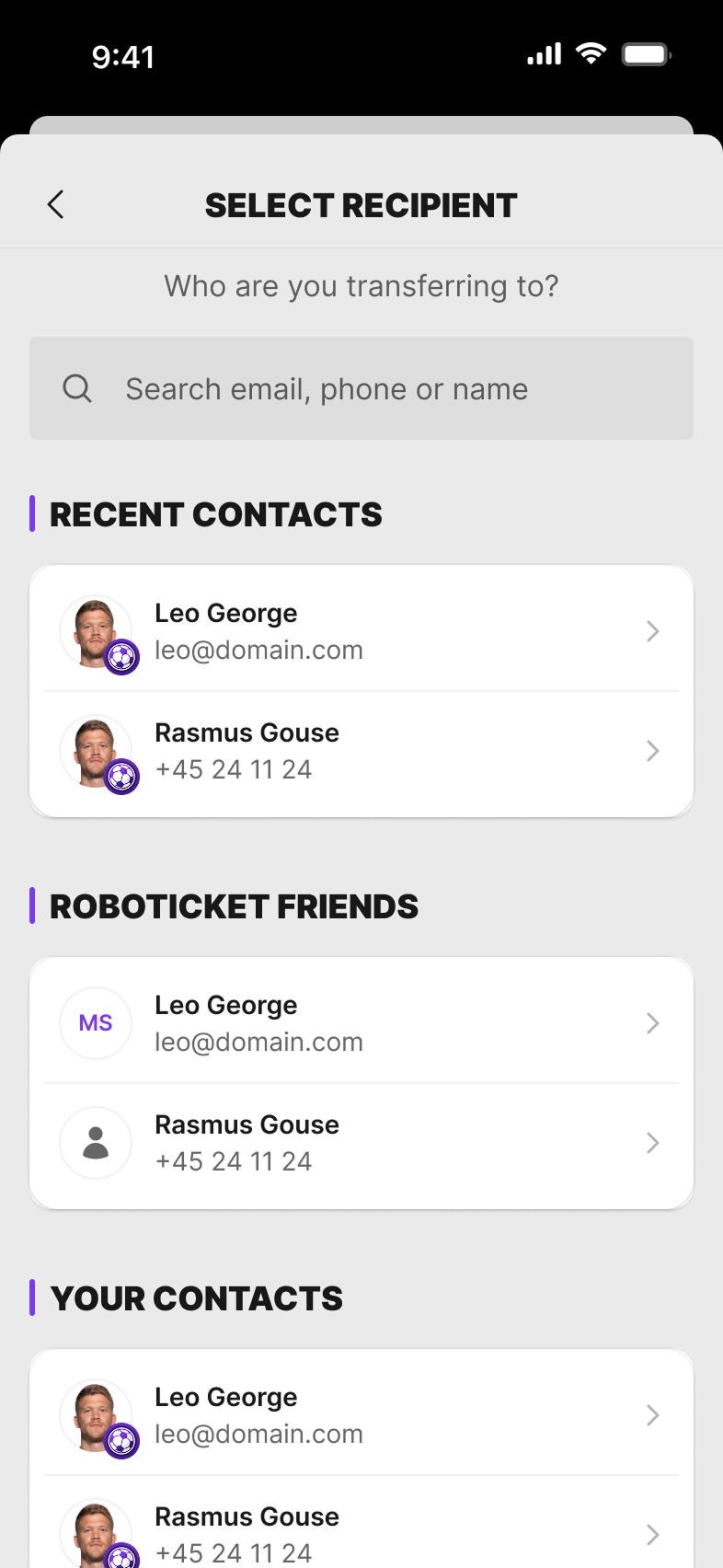
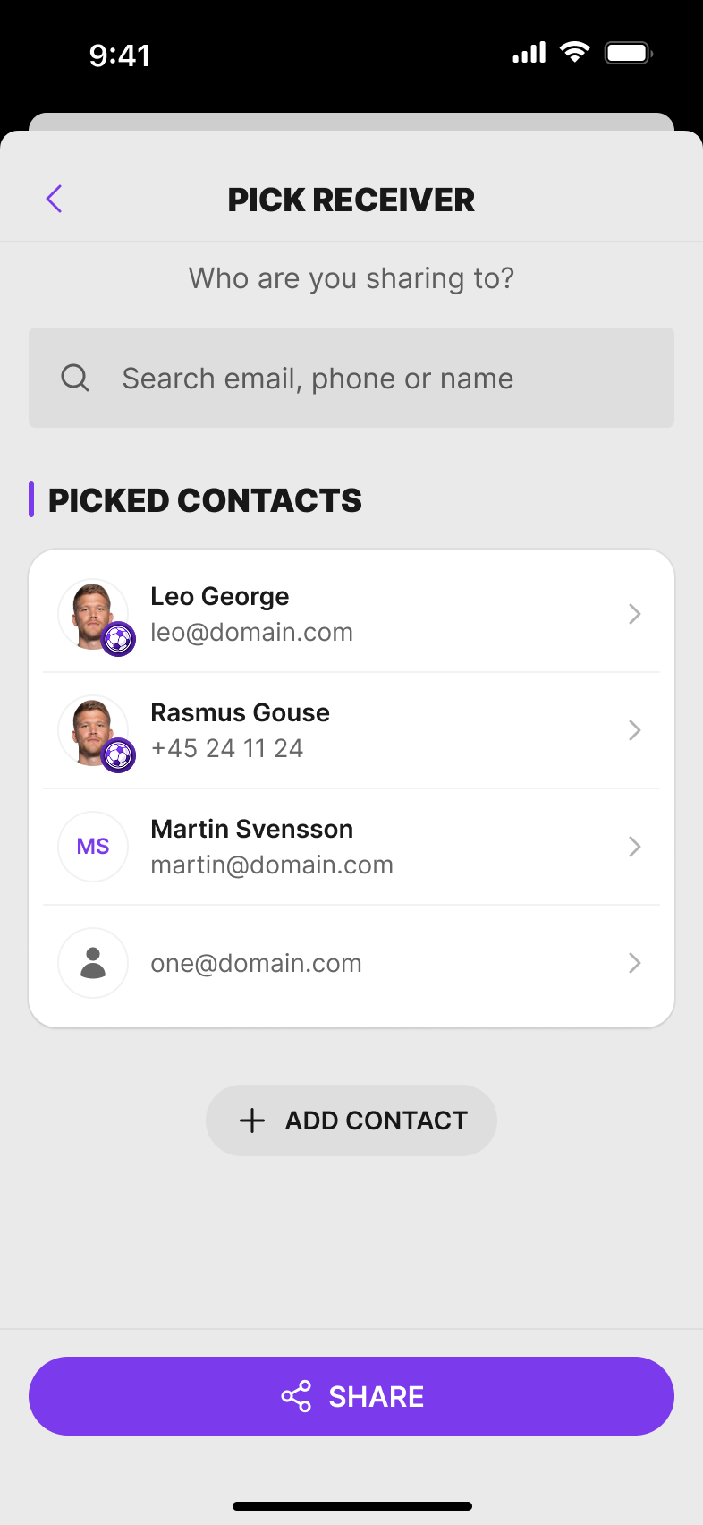
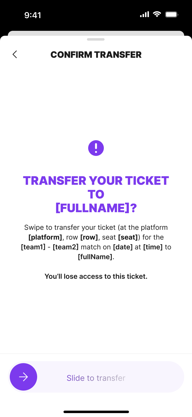
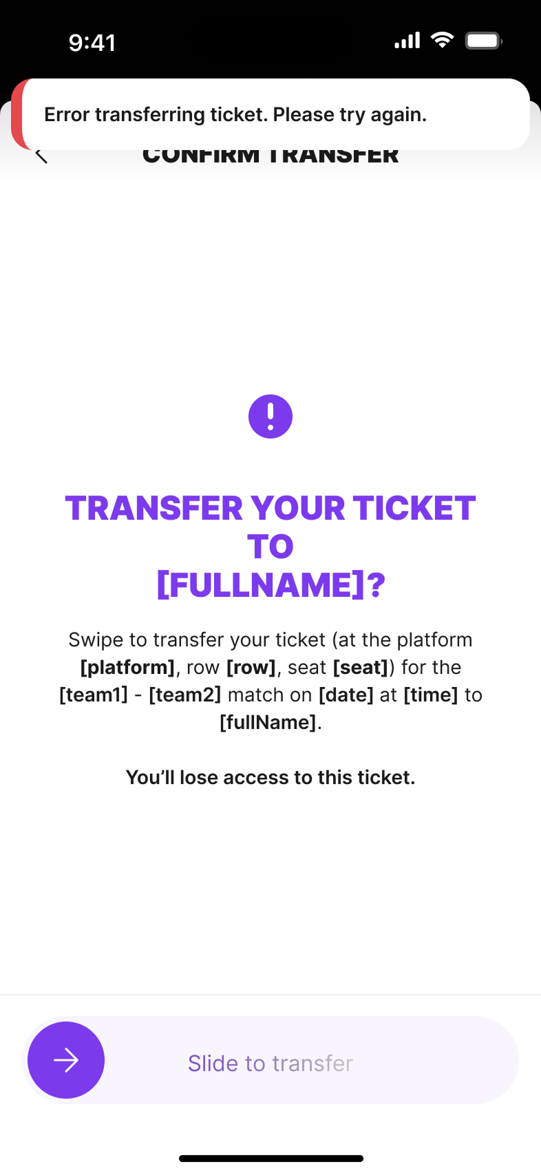
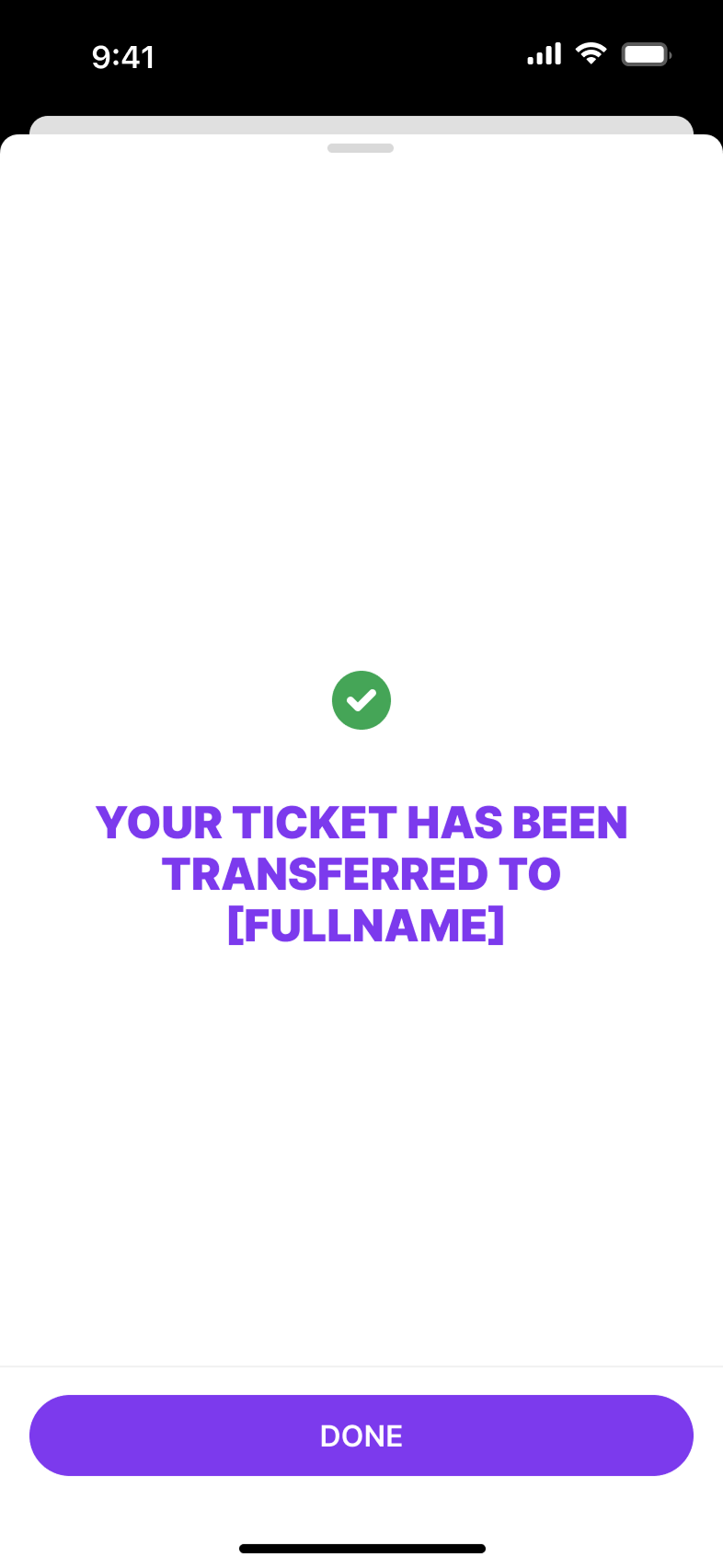
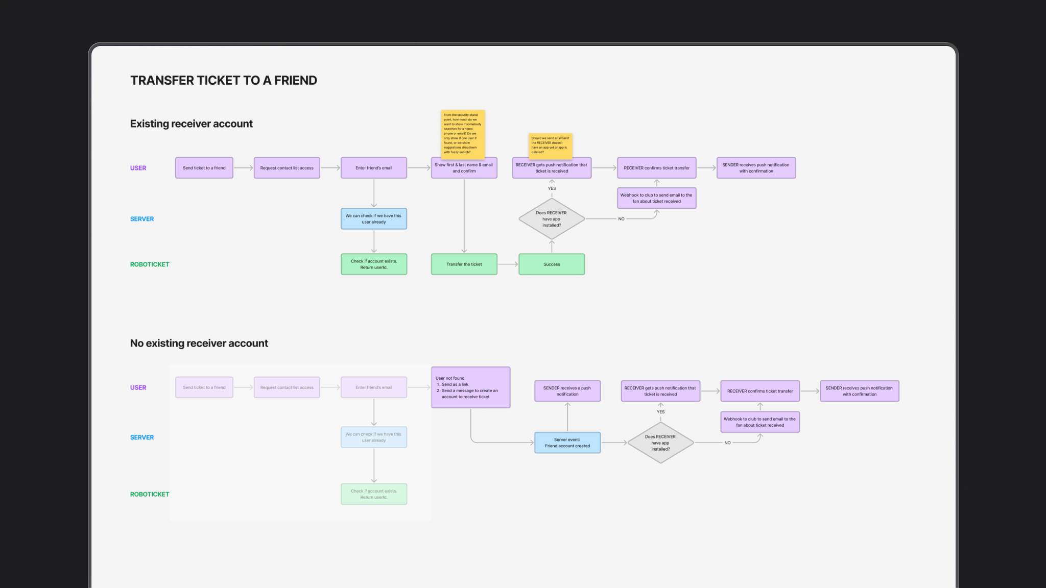
Sending a ticket is not one screen. No friends in the list, contacts permission, confirm with a swipe, then success or an error toast if the provider fails.
3. Eventii — another provider
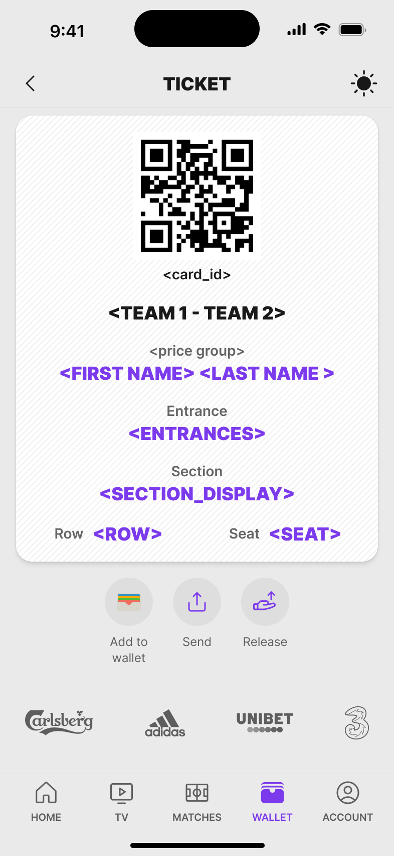
Eventii could not follow the same transfer. The ticket is sent by email. If the friend has no account, the sender gets a separate confirmation that an account has to be created.
.png)
.png)
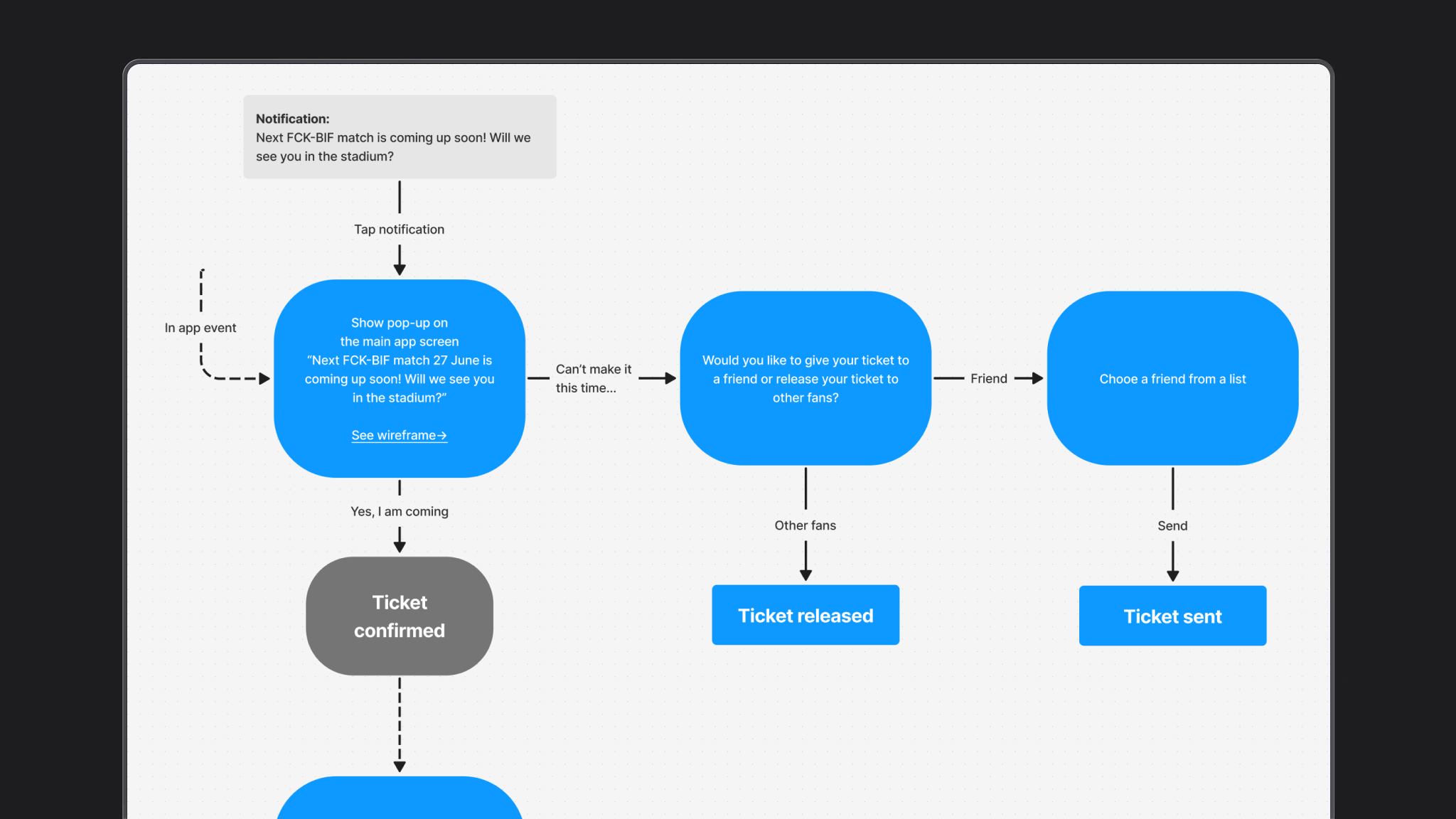
Before the screens: confirm, send or release
On the FCK board I mapped the decision first. Before a match the fan either confirms they are going, sends the seat to a friend, or releases it. The screens above follow that split — plus the extra Eventii path when the friend is not in the app yet.
Fan web cabinet
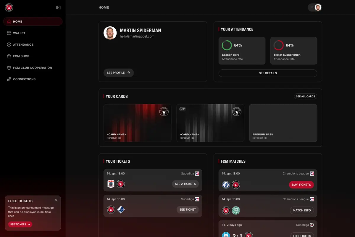
The same product also had a web cabinet for season-card holders. I designed the home view around what a fan checks before a match: attendance, cards, tickets, and the next games. The goal was to keep the layout scannable on desktop without copying the mobile app one-to-one.
Result
The work supported:
Platform results. Product numbers, not personal ones.
+50%
active users
1.2M
monthly sessions
Additional
ticket and shop sales
Lower
no-show rates
I don’t treat these numbers as “my personal score”. They belong to the product. My part was making the interface clearer, more relevant, and easier to use.
What I learned
A white-label product is less about one beautiful screen and more about a system that can stay clear when the brand, content, and audience change.