
Design system for multi-brand club apps
A shared UI system for a white-label product. The same components had to work for many football clubs, each with its own brand, colors, and content.
My role
I built and maintained the design system in Figma: the core components, states, and rules that kept the apps consistent. I worked with product and developers so the system was useful not only for design, but also for delivery.
The problem
Every new club app took too much time. Too many screens were designed from scratch, the UI started to drift, and development slowed down. We needed one system that could support many brands without making each app feel generic.
The constraints
- One system had to serve many club identities
- The components needed to stay simple enough for daily product work
- The system had to help both design and development, not become a separate layer of work
- New club apps needed to launch faster without losing consistency
The process
I started from the screens we reused most often: home, content cards, buttons, navigation, and match-day entry points. Then I looked at what changed from club to club, and what had to stay the same.
The main question was:
what should be a shared component, and what should stay flexible for brand and content?
What I designed
- A component library in Figma
- Reusable patterns for buttons, cards, navigation, and content blocks
- A theming approach for different club brands
- Basic rules so the team could use the system without guessing
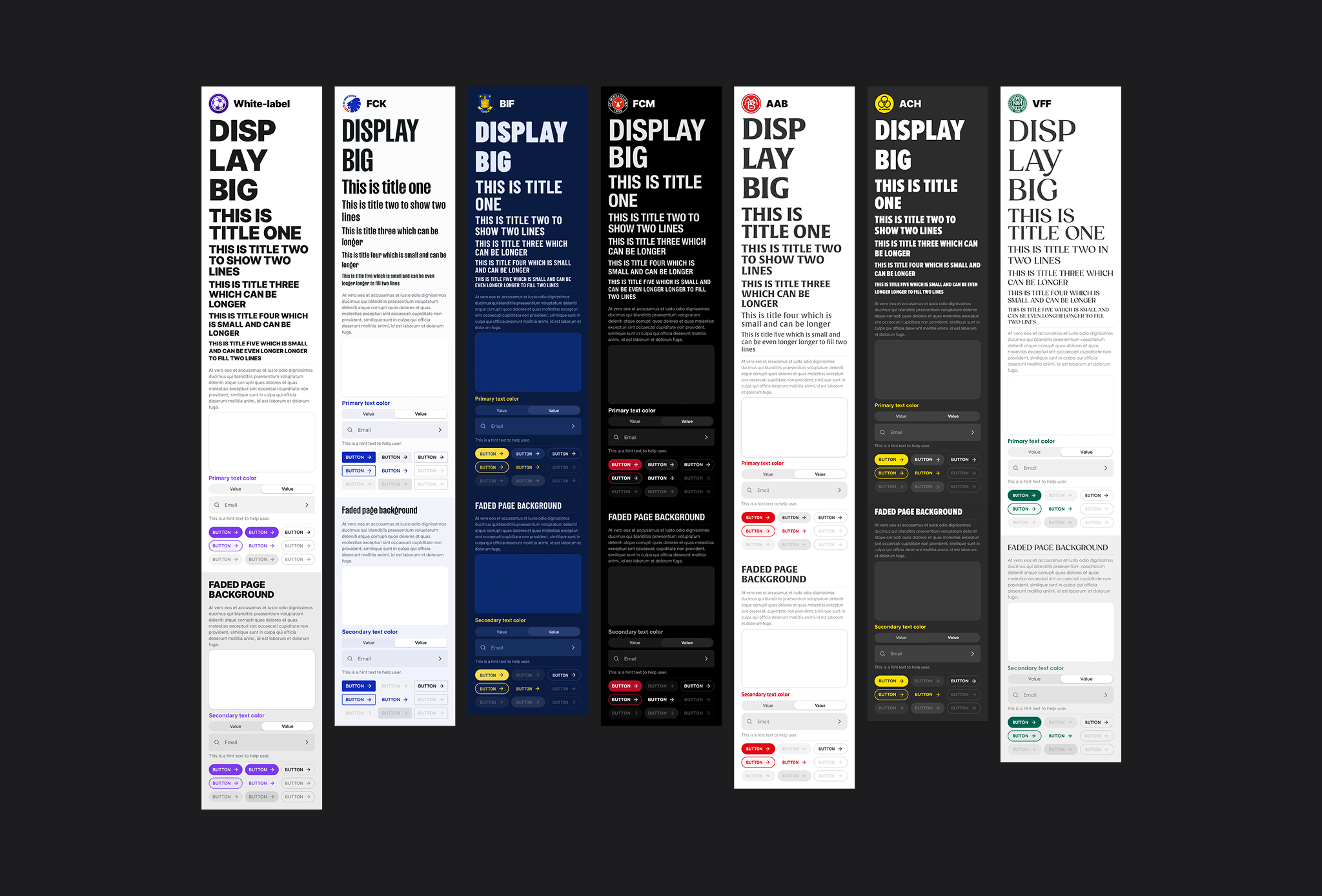
Variables and styles theme library
The core pieces used across the product: variables, colors, text styles, buttons, cards, inputs, and navigation. The image shows an example of such a test drive.
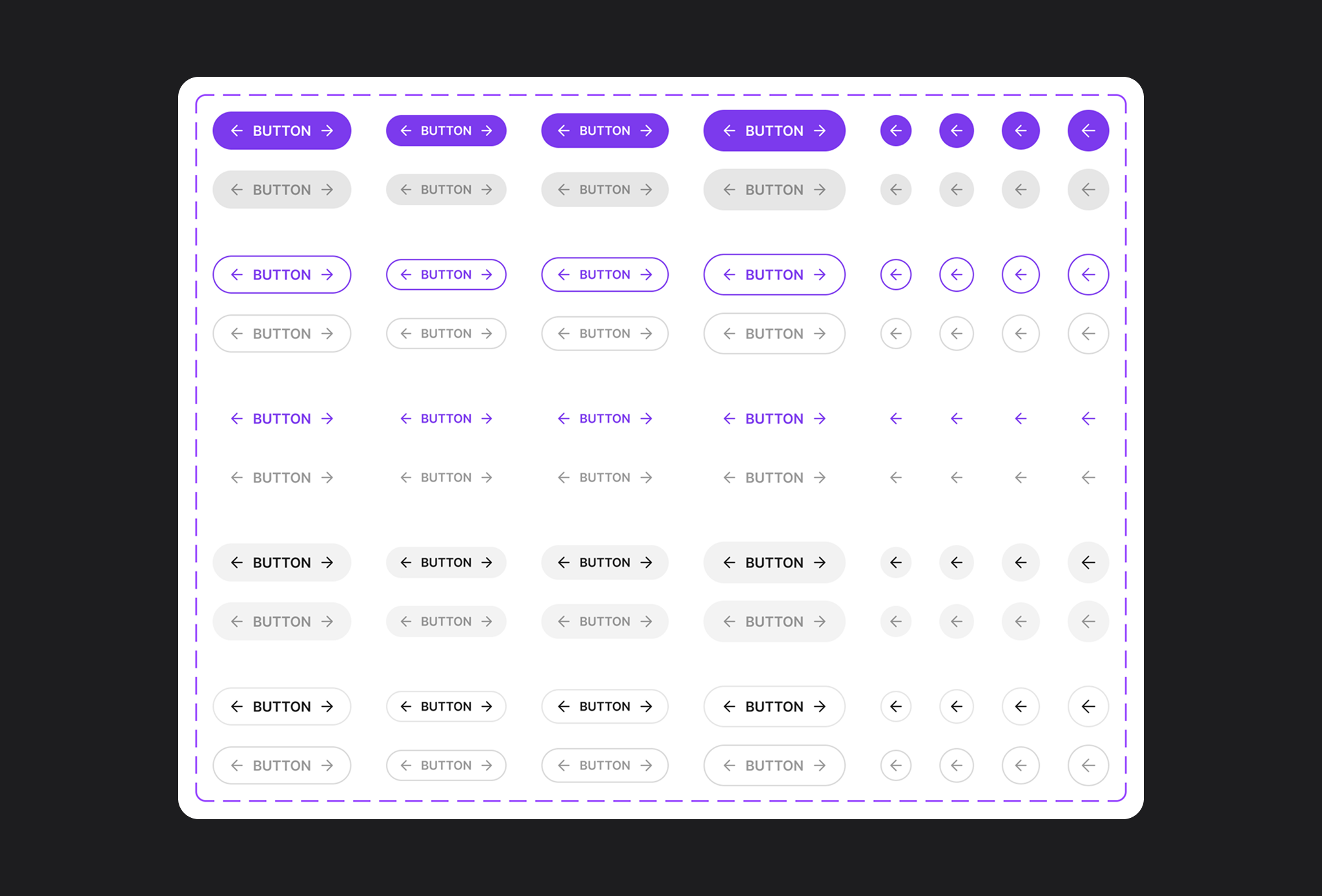
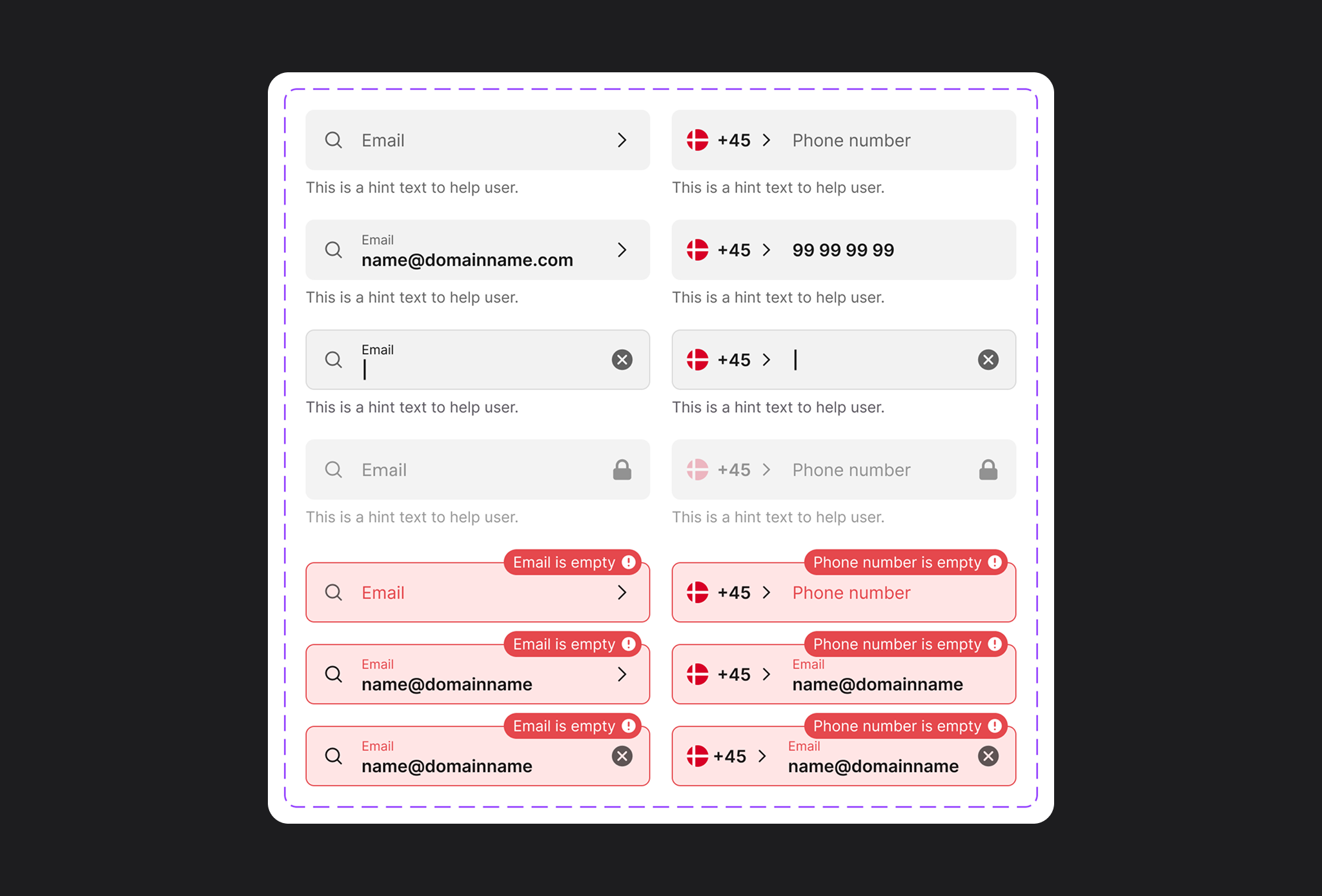
One component, several states
Default, hover/pressed, disabled, and loading. The system had to cover real use, not only the happy path.
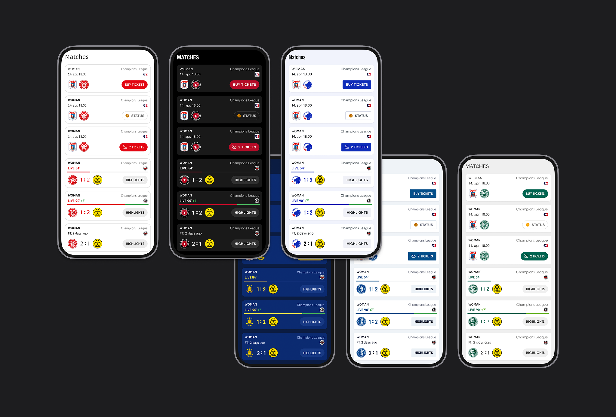
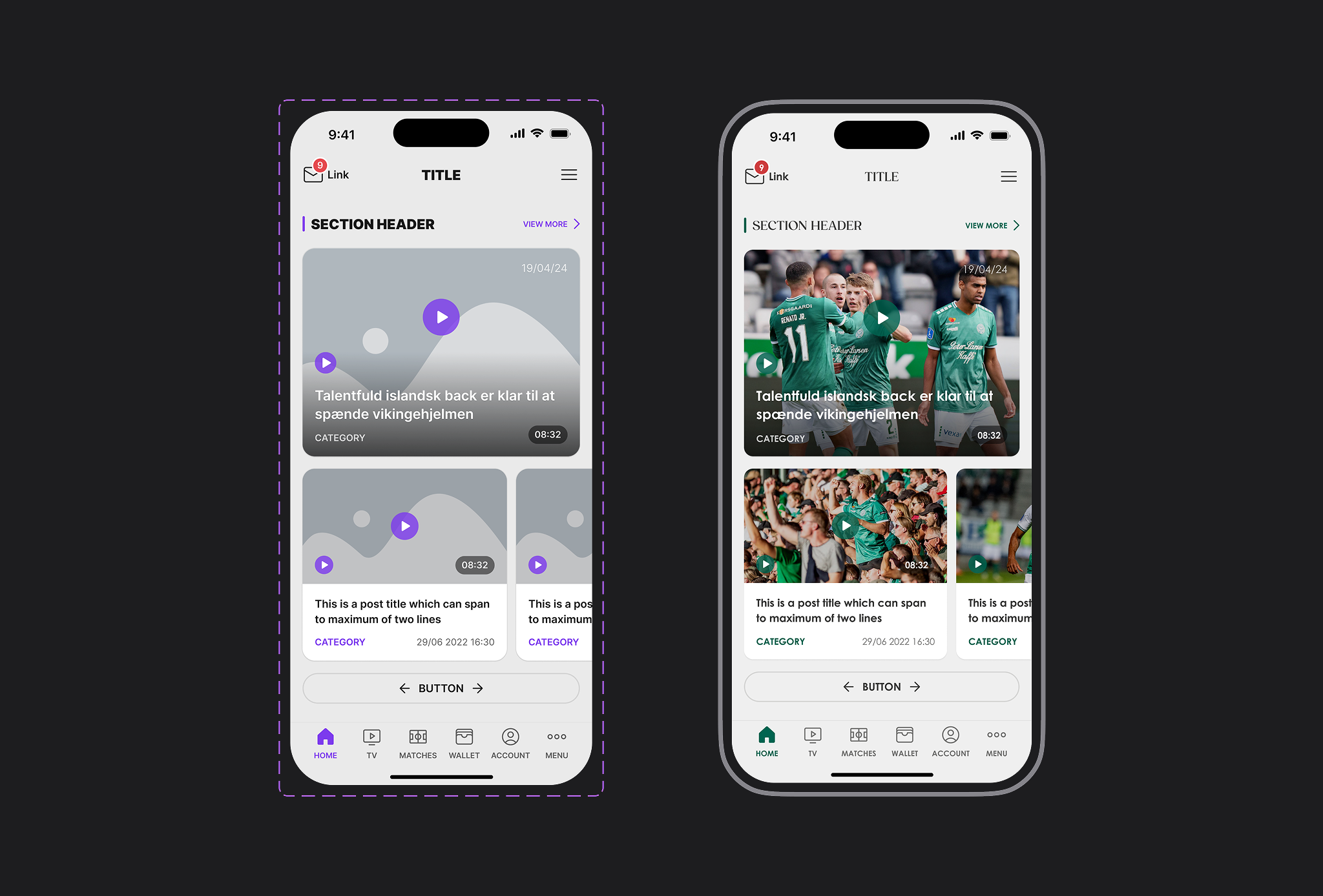
Same layout, different club brand
The structure stays the same. Color, logo, and content change. This was the main white-label problem.
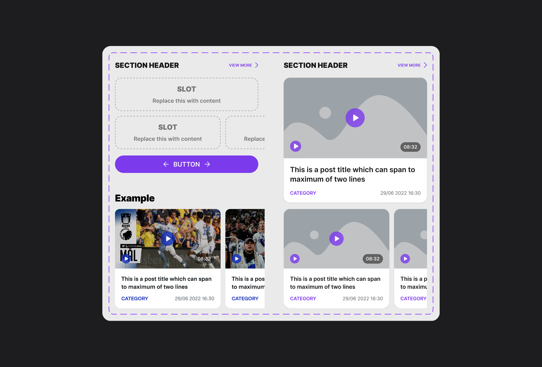
Content card in the system
A reusable block for news, videos, offers, or match content. One pattern, many uses.
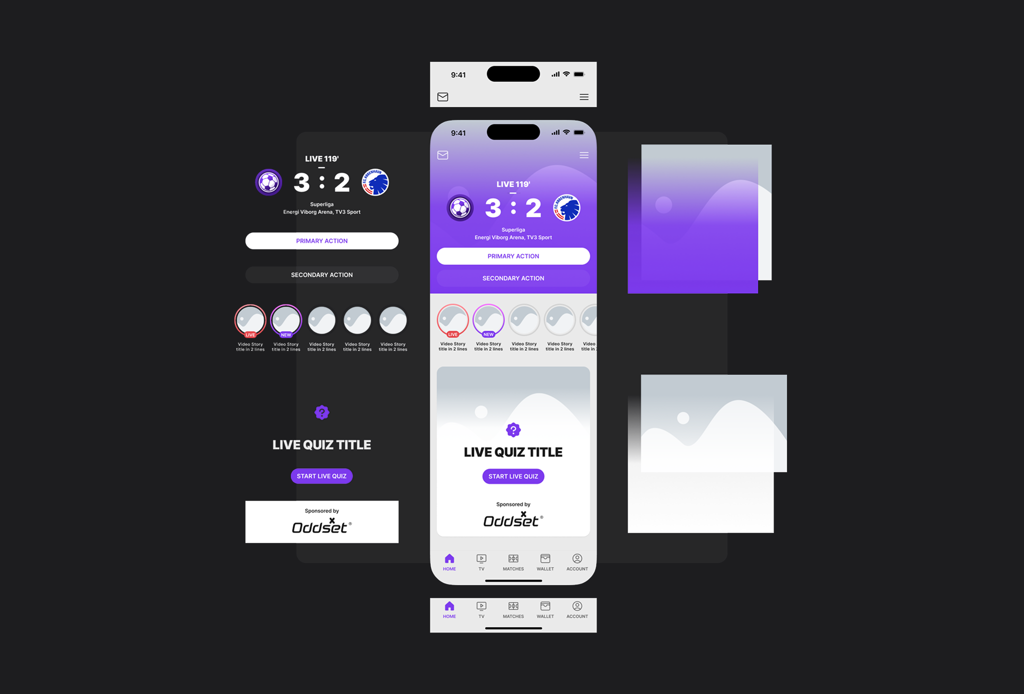
Before / after
How a new club screen was assembled from the system instead of being designed from scratch.
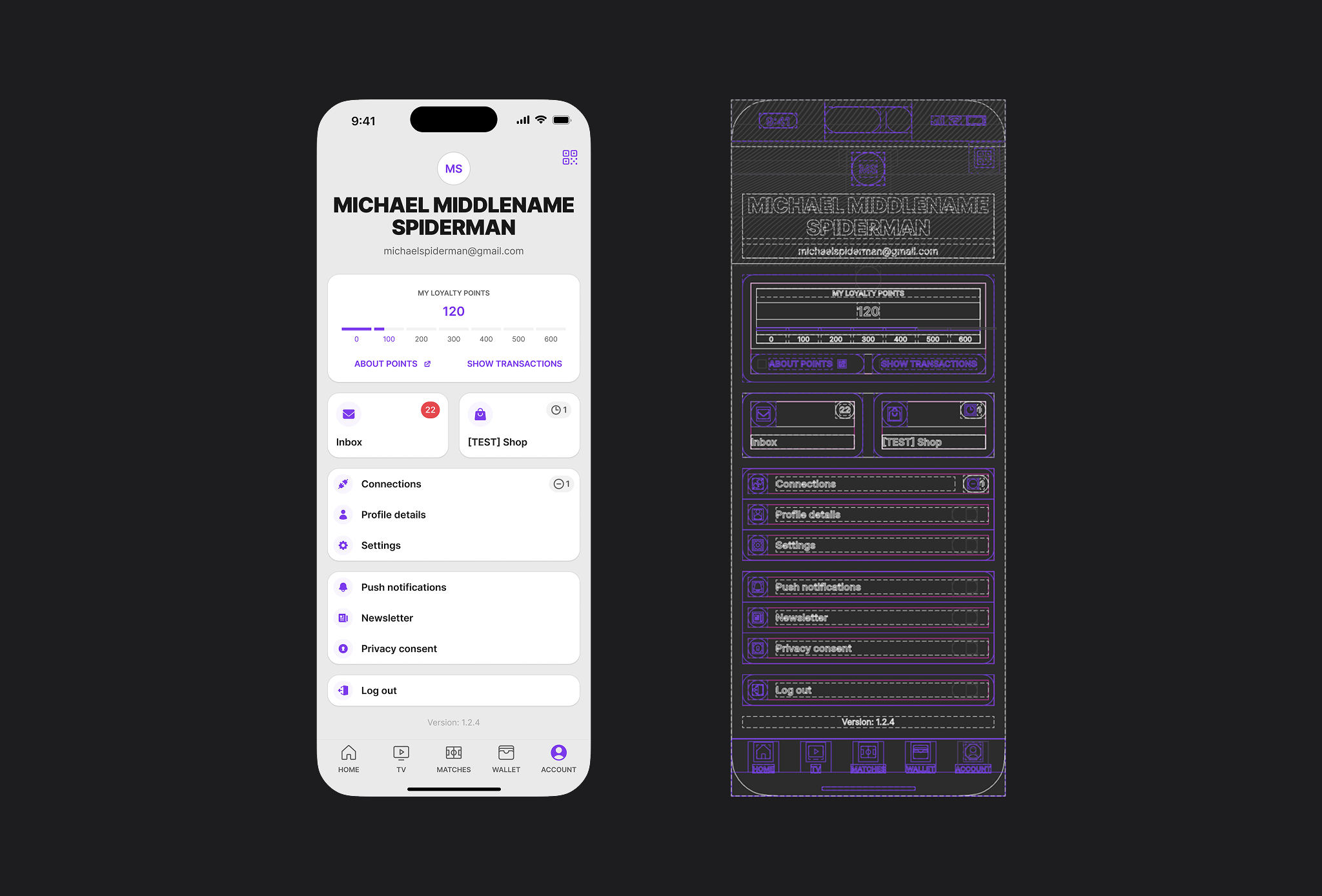
The goal was not to make a large library for its own sake. The goal was to make the next club app faster to design and easier to keep consistent.
Result
The system helped launch and maintain 10+ club apps with a more consistent UI and less repeated design work.
I do not have a single hard number for time saved. What I can say is this: new screens stopped starting from a blank page, and the product became easier to scale.
What I learned
A design system works when it reduces decisions. If the team still has to invent a new pattern for every screen, the system is not doing its job.