
Personalized offers and voucher flows
A match-day flow inside the club app. The goal was simple: show a relevant offer at the right moment, and make it easy to use even in a crowded stadium.
My role
I designed the voucher and offer experience end-to-end: how the offer appears, how a person activates it, and how it fits into the rest of the app. I worked with product and development on a flow that had to be fast, clear, and usable with one hand.
The problem
On match day many fans did not buy food, drinks, or merch in the app. Offers were easy to ignore, and the path from “I saw the offer” to “I can use it” had too much friction.
The constraints
- The flow had to work in a noisy stadium, often with a bad connection
- The offer needed to help the club and the sponsor without feeling like a hard sell
- The interface had to stay simple. One extra step would kill the action
The process
I started from the moment a fan receives the offer, not from the voucher itself. The main questions were:
- When should the offer appear?
- What does the person need to understand in 2–3 seconds?
- What is the shortest path to activation?
Then I simplified the flow and removed anything that did not help the person act.
What I designed
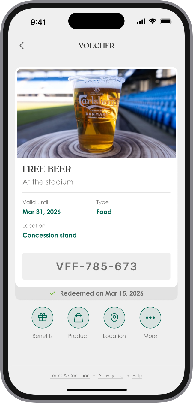
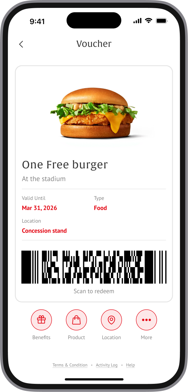
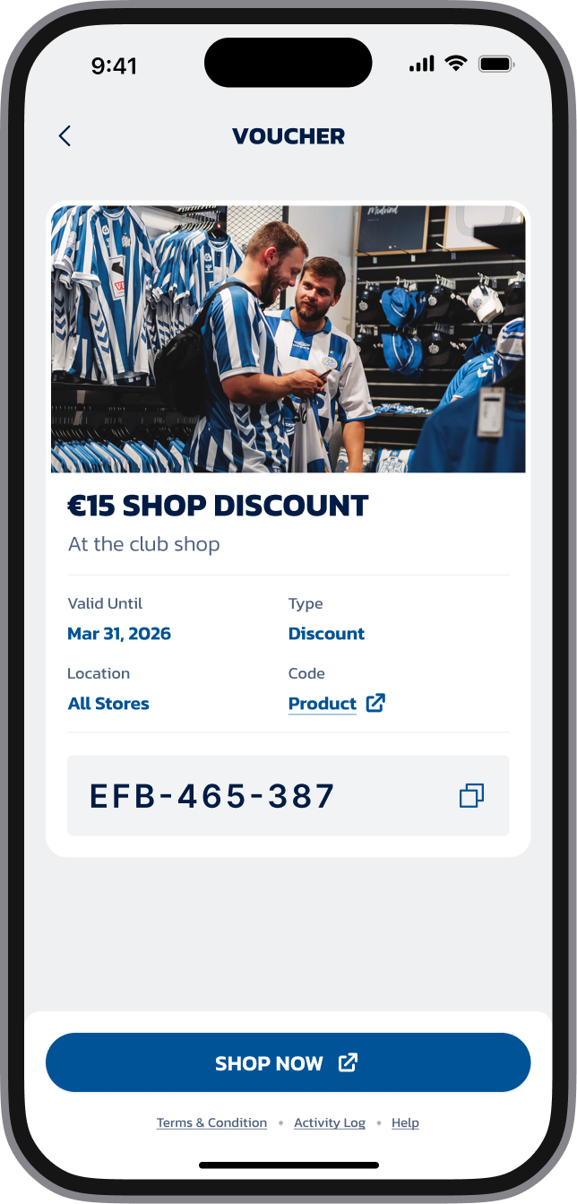
- A clearer offer card with one main action
- A short activation flow
- A state after the voucher is activated, so the person knows what to do next
- A way to show sponsor branding without breaking the app UI
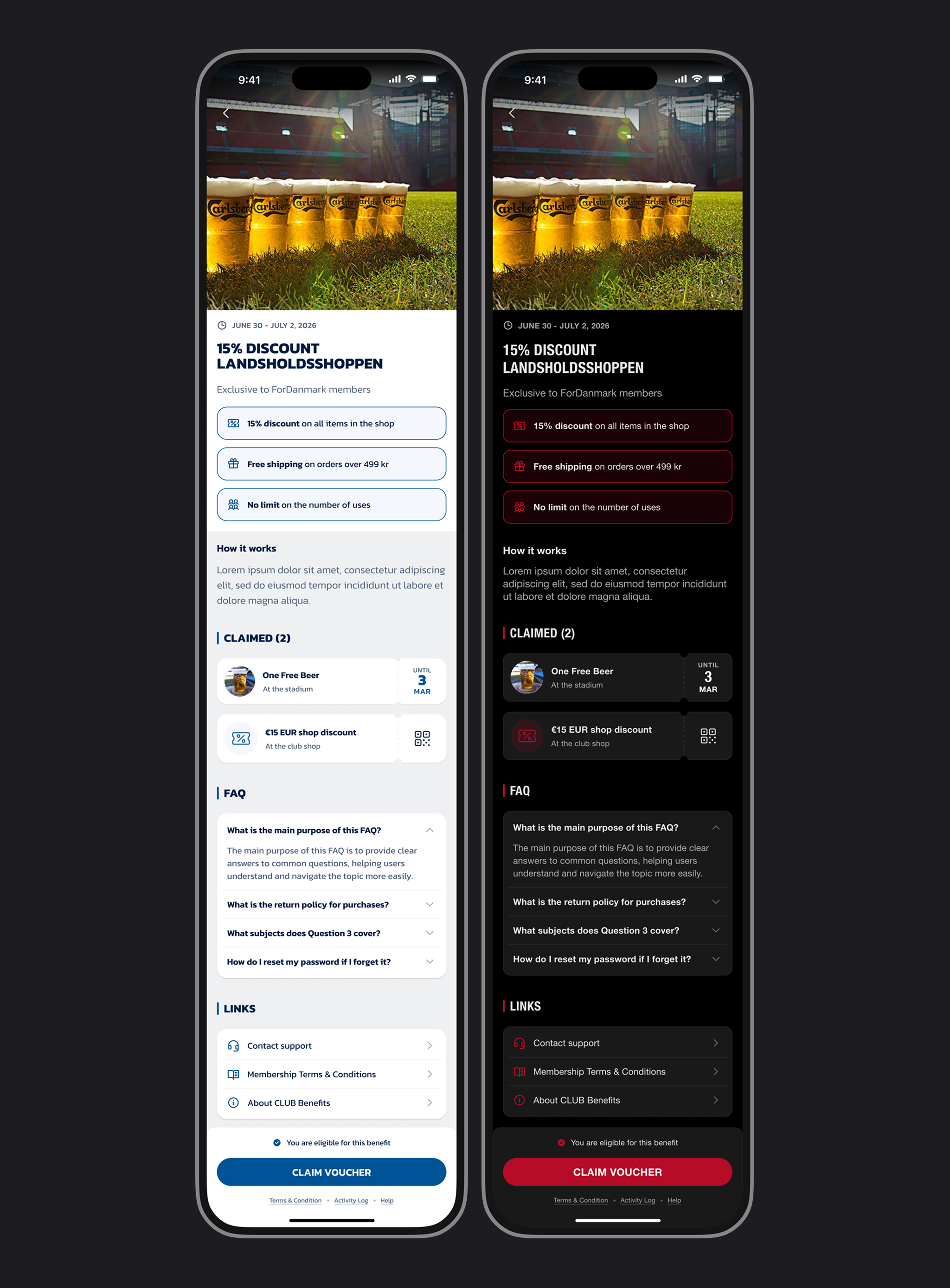
Campaign screen
Offer, benefits, action.
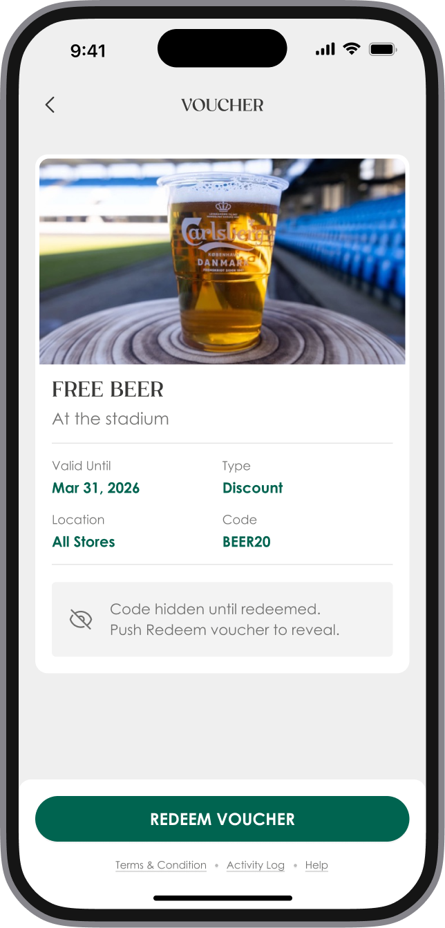
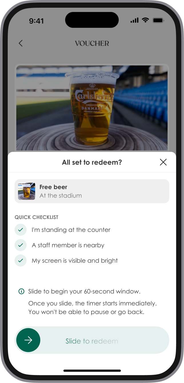
Activation flow
A short path from tap to voucher. Built for match day, not for a quiet evening at home.
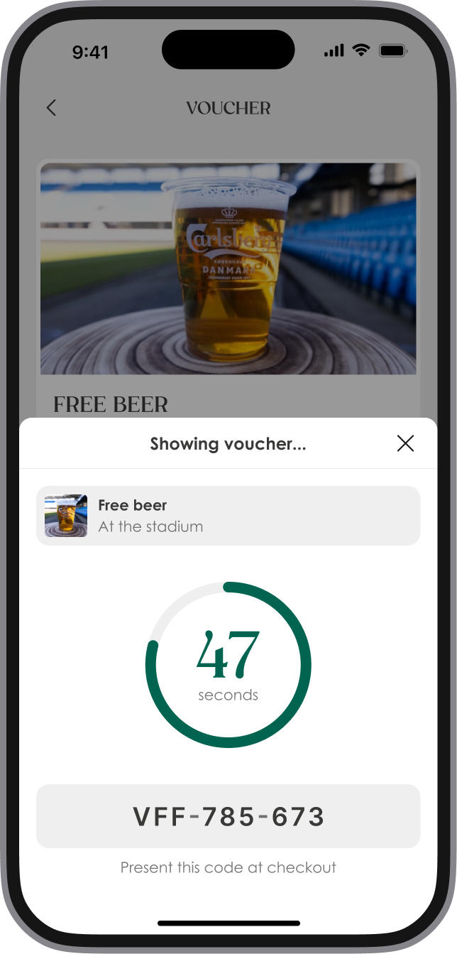
Activated state
The person should immediately understand that the offer is ready to use.
Result
The work supported:
Platform results. Product numbers, not personal ones.
13%
of users added food and drinks after a personalized offer
+14%
ticket purchases with a drink voucher
87%
open rate on targeted messages
These numbers belong to the product, not only to the interface. My part was making the offer easier to notice, understand, and use.
What I learned
A good offer screen is not louder. It is clearer. If a person needs more than a few seconds to understand the benefit, the offer is already too late.