
Keel — AI Financial Management
Concept — not a shipped product
A mobile banking concept. The home screen shows the balance. The rest of the app is there to answer a smaller question: is this fine, or do I need to do something.
My role
I designed the main mobile screens: home, spending, saving, investments, bills, subscriptions, credit score, and security. The work is a concept, not a shipped product.
The problem
A balance and a transaction list are not enough. Bills, tax, subscriptions, and a suspicious payment sit in different places. People open the app to check one thing and leave without seeing the thing that actually needs a decision.
The constraints
- One glance on a phone. The number comes first, the explanation second.
- AI stays inside the screen. No chat on every page.
- Suggestions need a next step: review, pay, simulate, or turn something on.
- Same layout across Home, Spend, Goal, Insight, and Alerts.
The process
I started from the check, not from the feature list. What does a person want to know in a few seconds, and what can wait.
Then I split the app by that check: money now, spending, a saving goal, investments, bills, and something that looks wrong. Deeper screens open from home. The tab bar stays on the five main places.
What I designed
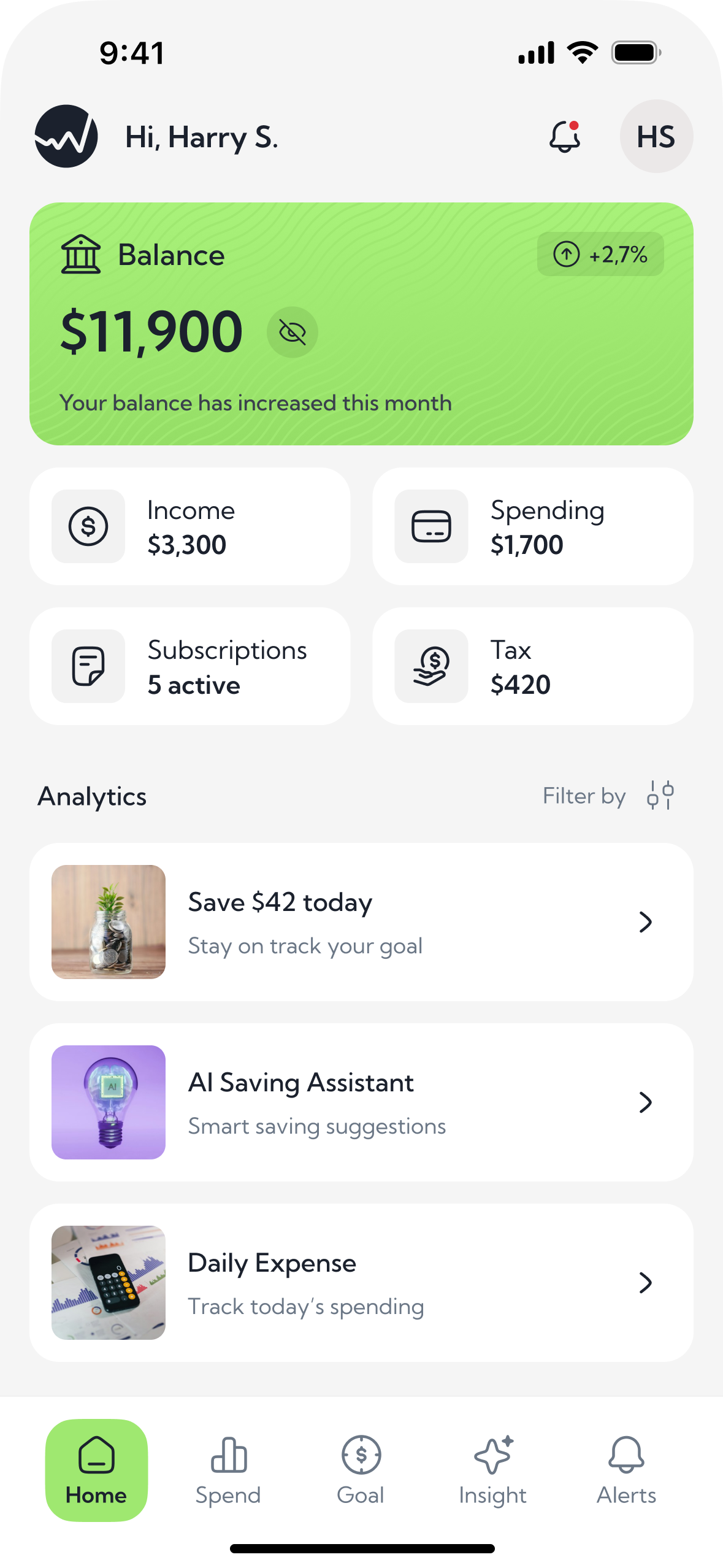
- A home screen that leads with the balance, then income, spending, subscriptions, and tax
- Short entries into saving, daily spend, and the assistants
- One card pattern for lists: icon, title, one line of context, amount or action
- Green only for the active state, a positive change, or the main action
Home / Spending / AI saving assistant
Home. The entry point. In a second you see whether the money is fine, and where to go next: spending, subscriptions, tax, a goal. Not a dashboard for its own sake.
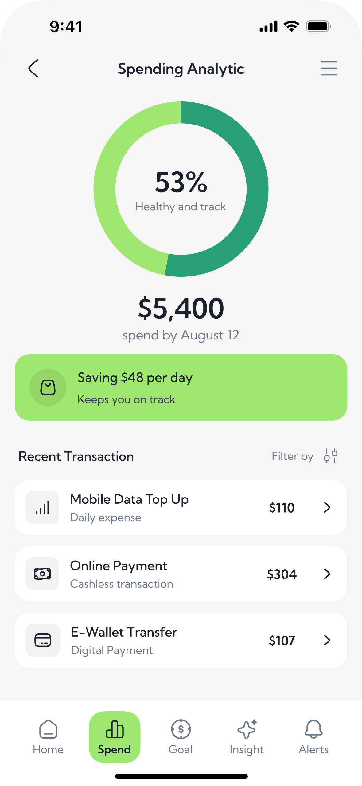
Spending Analytic. The “am I spending too much” screen. Not a statement. A pace: how much is already gone, and how much a day still keeps you on track. The payment list is only there to back the number.
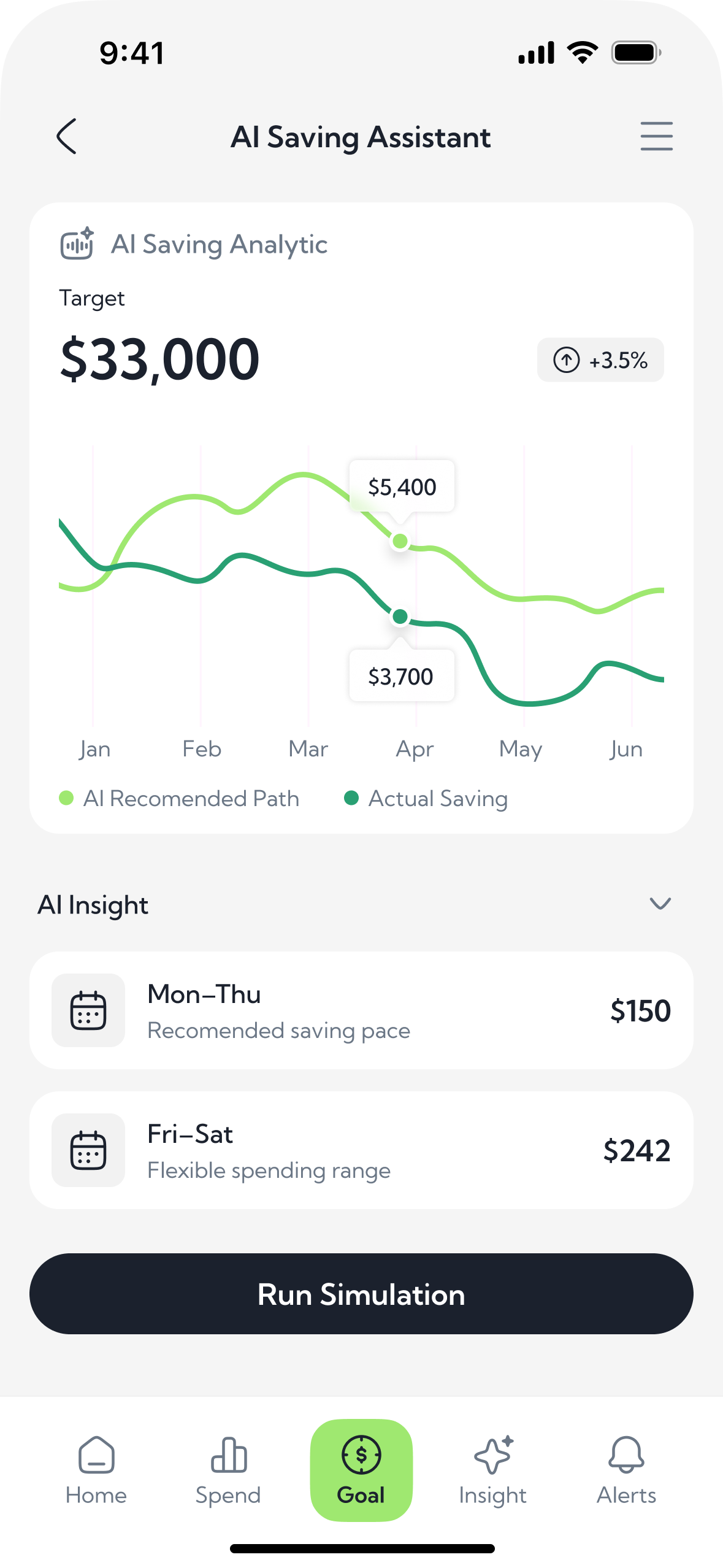
AI Saving Assistant. The goal screen. Not “save more”. It compares the path you should be on with what you actually saved, then splits the week into a weekday pace and a weekend range. Simulation is there to test a scenario, not to read a tip.
Smart subscriptions / Credit Score / Investment Assistant
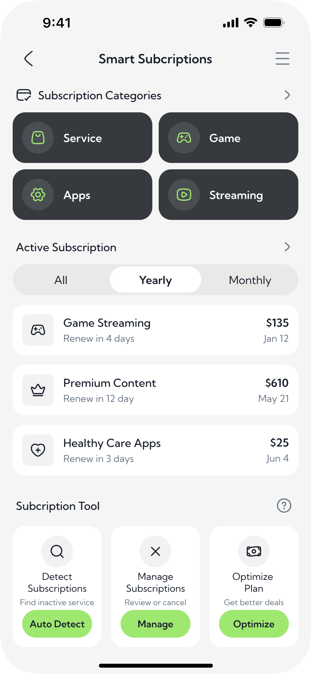
Smart Subscriptions. Control over recurring charges. What renews soon, what you can drop, where a cheaper plan exists. Categories are only there so a streaming app is not buried under the internet bill.
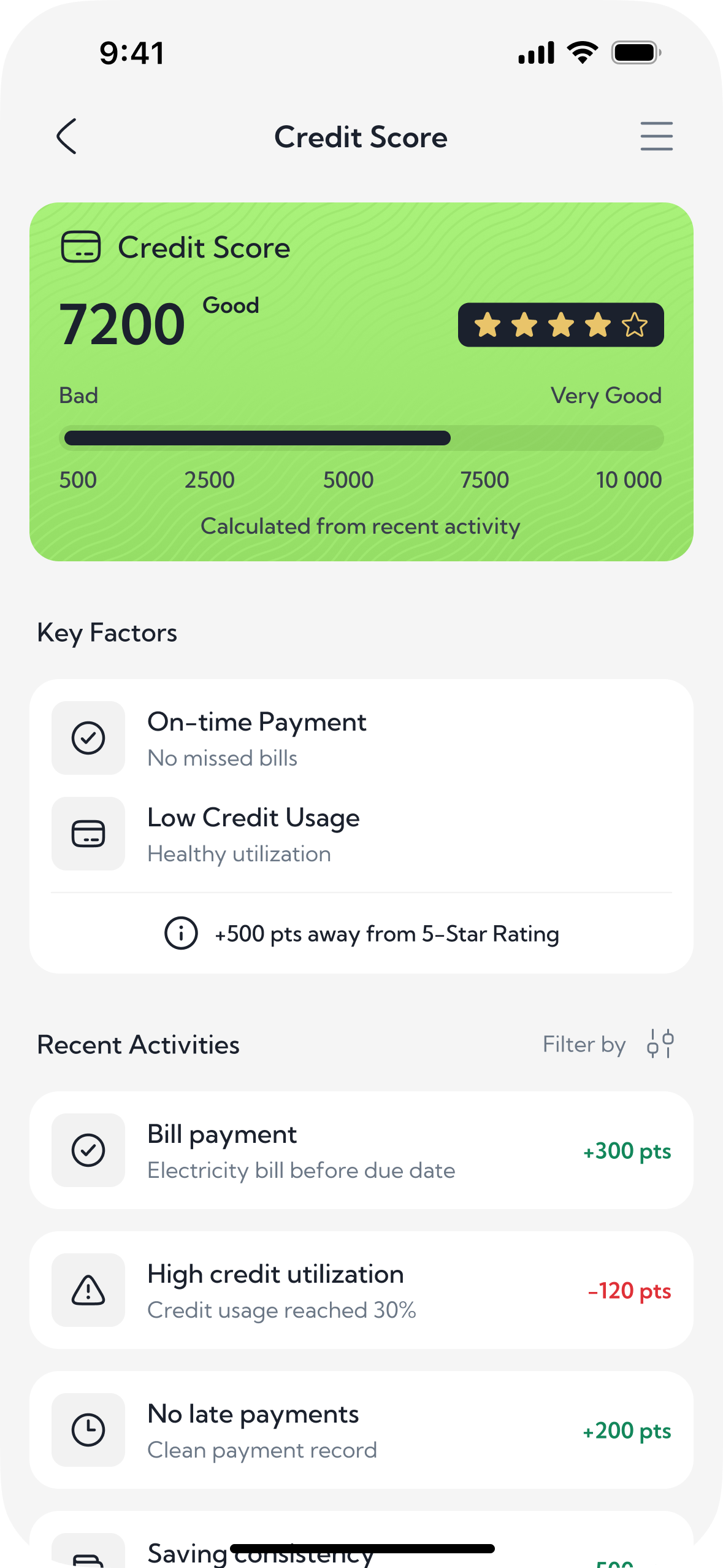
Credit Score. Not the score for its own sake. Why the number looks like this, and what moved it. Factors and recent activity answer “what changed”, without a separate report.
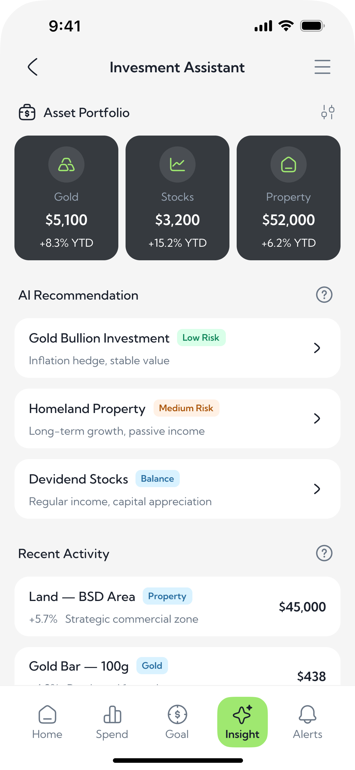
Investment Assistant. Where the portfolio stands, and what to do with it. Your assets and how they moved, then options with a risk level, then what you already bought. A suggestion with no portfolio behind it would be empty.
Alerts and security / Bills and tax
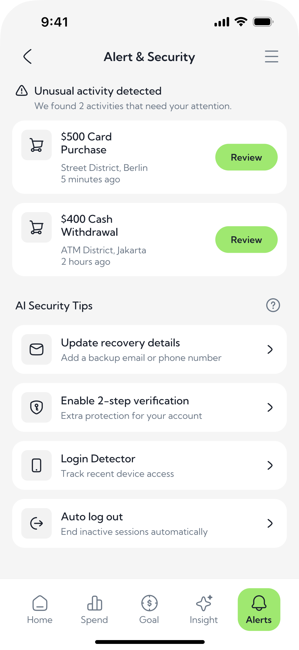
Alert & Security. The only screen that asks for an action now. Two unusual payments, each with a review. Account checks sit apart, so the next gap is closed before it becomes an alert. The urgent list and the quiet settings are not mixed.
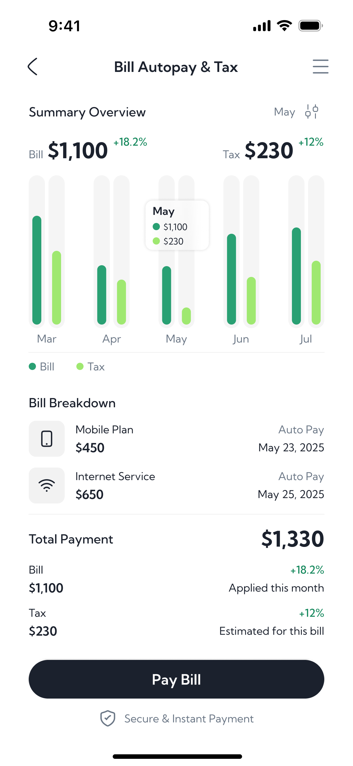
Bill Autopay & Tax. Bills and tax in one place, because for the person it is the same question: what is about to leave the account. The breakdown shows what is already on autopay. Pay is on this screen, so you do not have to leave for it.

Result
Concept screens only. Nothing here is a live metric.
The set shows a banking UI where each screen has one job, and the assistant is a suggestion with an action — not a chat window.
What I learned
A finance screen fails when the number and the next step are in different places. If the person has to hunt for “what do I do with this”, the insight is already too late.